Curve Communications Group Ltd. -9 W Broadway, Vancouver, BC V5Y 1P1
T. 604-684-3170 [email protected]

Stop Losing Leads You Already Paid For
Lead Generation and Marketing for Small Businesses
Most small businesses don't have a traffic problem. They have a follow-up problem. We build one system where your website, SEO, ads, and automated follow-up all work together, so every lead gets answered and nurtured automatically. Even at 9pm on a Sunday.

George Affleck, Founder
Stop Losing Leads You Already Paid For
Lead Generation and Marketing for Small Businesses
Most small businesses don't have a traffic problem. They have a follow-up problem. We build one connected system. Your website, SEO, ads, and automated follow-up all work together, so every lead gets answered and nurtured automatically. Even at 9pm on a Sunday.
George Affleck, Founder
25+
years in business
400+
clients served
Vancouver-based
serving Canada
Your data is
always yours
Our Clients


25+
Years In Business
497+
Clients Served
Vancouver-
Based
Serving
Canada
THE MISSED-CALL MATH
How many calls did your business miss this week?
Here’s the math nobody likes. If you miss 5 calls a week and even 1 of them
was a real job, that’s 50+ lost customers a year. You don’t need more
ads. You need a system that answers every call, replies to every form,
and follows up until the lead books or says no.
That’s what we build.
24/7
AI receptionist answers when you can’t
Under 60 seconds
average speed-to-lead with automated follow-up
0 leads
left sitting in your inbox
The Strategy
The Growth System: Traffic, Conversion, and Follow-Up
Lead generation isn’t one tactic. It’s three jobs done together.
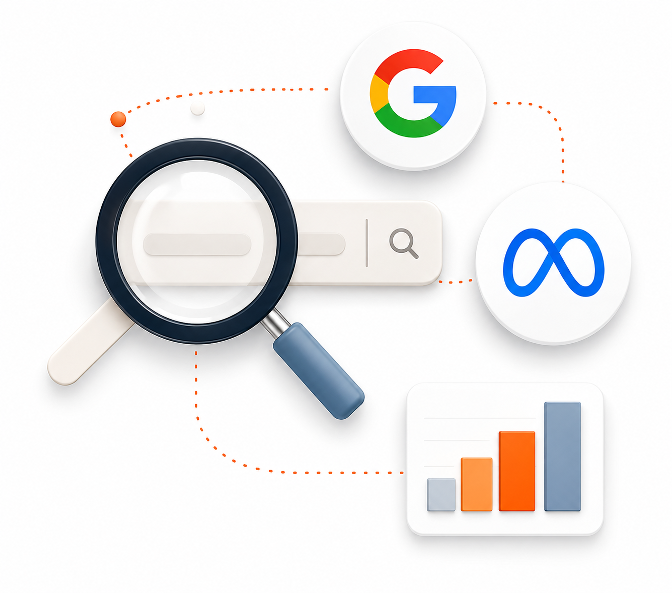
Get Found
SEO, Google Ads & Meta Ads. Show up when people in your area are searching for what you do, and stay in front of the ones who aren’t ready yet.
Get Chosen
Websites, Landing Pages & CTAs. Your website’s job isn’t to look nice. It’s to turn a visitor into a booked call or a form fill. We design for that.
Get Booked
CRM, Automation & Voice AI. Most leads are lost after the click. Our follow-up systems respond instantly, nurture automatically, and book appointments while you work.
Not every business needs every channel. We recommend the right mix for your budget and goals, and we’ll tell you if something isn’t worth your money.
What We Do
Websites That Convert
Conversion-optimized websites and content that turn visitors into leads, not just compliments.
Conversion-focused design and copy
Mobile-first, fast-loading builds
SEO-ready structure from day one
Clear CTAs and trust signals on every page

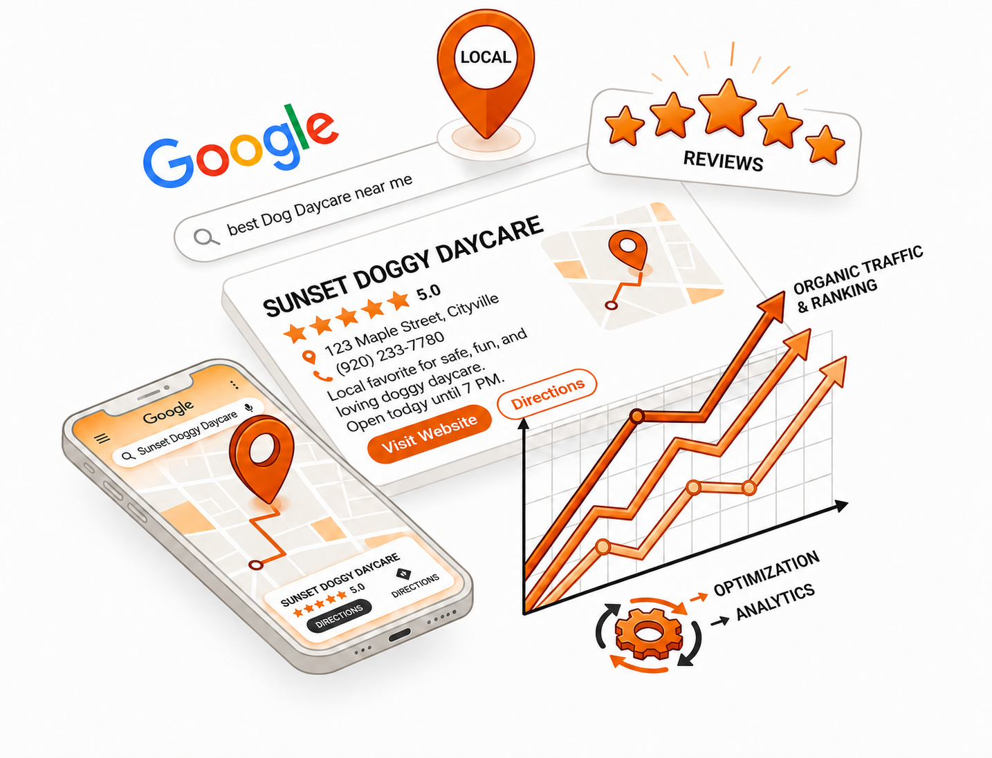
Local SEO That Compounds
Own your local market on Google. Visibility that builds month over month instead of disappearing when you stop paying.
Google Business Profile optimization
Local keyword targeting
Review generation strategy
Citation building and cleanup
Ads That Pay For Themselves
Google captures the people searching right now. Meta builds demand with everyone else. Together they fill your pipeline.
Google Search and Display
Meta, Facebook and Instagram campaigns
Retargeting and lookalike audiences
Weekly optimization, monthly reporting you can actually read
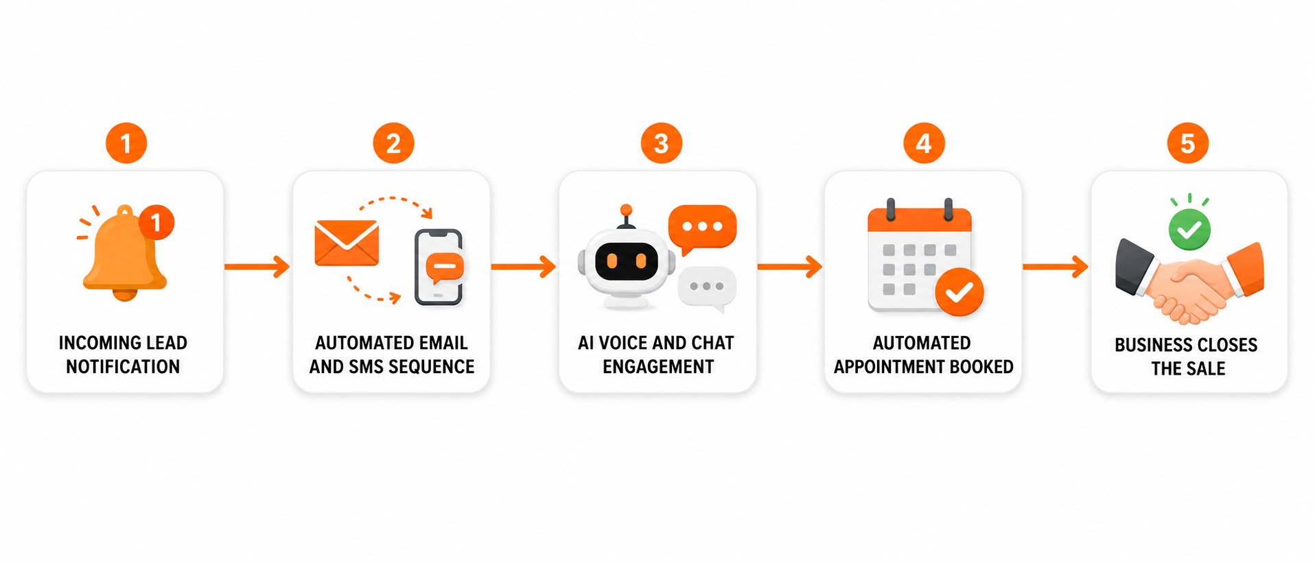
Follow-Up On Autopilot
One platform for your CRM, automation, and reputation management. One login, not five subscriptions.
Automated lead follow-up sequences
Instant chat response on your website
Unified pipeline so nothing slips
Review requests sent automatically after every job
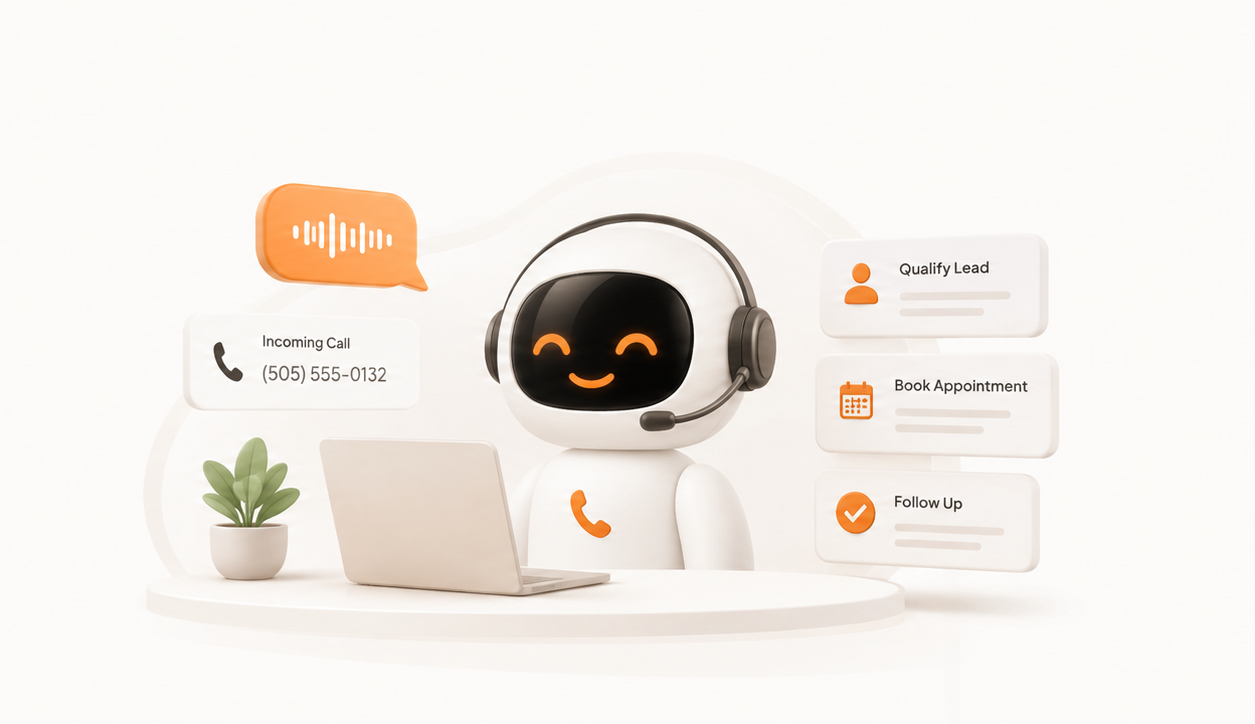
Never Miss Another Call
An AI receptionist that answers 24/7, sounds human, qualifies callers, and books appointments straight into your calendar.
Answers every call, day or night
Asks your qualifying questions
Books directly into your schedule
Sends you a transcript of every conversation
The Process
How We Build Your Growth System
Discovery & Strategy
We audit your current marketing, find the biggest leaks, and build a plan around your budget. You’ll know the cost before we start.
Build & Launch
We build your website, set up CedarCRM, launch your campaigns, and switch on your follow-up automation.
Optimize & Scale
We watch performance daily, cut what isn’t working, and put more behind what is. Monthly strategy calls keep you in the loop.
Grow & Compound
As the system matures, your cost per lead drops and results stack. Marketing stops being a gamble and starts being a line item you can predict.
WHO WE SERVE
Trusted by Small Businesses Across Industries
From home services to healthcare, real estate to education, we help small businesses in every industry build lead generation systems that work.
Home Services
Contractors, builders, painters, landscapers, electricians, windows
Professional Services
Real estate, financial, legal, consulting, business associations
Health & Wellness
Dental, chiropractic, clinics, home care, eyecare, naturopaths
Education & More
Schools, daycares, personal brands, non-profits, tourism
CLIENT RESULTS
What Our Clients Say
“Curve didn’t just build us a website … they built a high-performance engine for our business. The site is clean, professional, and easy to use, and the automation now handles leads and follow-ups seamlessly.”
“Curve built the Pivot Travel brand and website from the ground up, creating a polished digital presence that reflects the premium experience we provide. Since launching, we’ve seen stronger traffic, engagement, and business momentum.”
“Curve continues to blow me away. They’re always improving something, always responsive, and continue to drive in a lot of leads. It’s money well spent, and the team is great to deal with.”

What Does It Cost?
Systems start at $497/month and scale with the channels you need.
No two businesses get the same quote because no two businesses
have the same leaks. On your free strategy call, we’ll look at what
you’re doing now, tell you exactly what your system would cost,
and tell you honestly if you don’t need us yet.
Frequently Asked Questions
What does Curve Communications actually do?
We build complete lead generation systems for small businesses — combining websites, Google Ads, Meta Ads, SEO, CRM automation, AI follow-up, and reporting into one connected system.
Do you only work with Vancouver businesses?
No. We’re based in Vancouver, BC, but we work with small businesses and member-driven nonprofits across Canada and North America.
What types of businesses do you work with?
We specialize in small businesses and nonprofits in industries like healthcare, home services, trades, real estate, education, hospitality, coaching, and professional services.
Do I need to manage multiple marketing vendors?
No. We manage the entire system for you — from your website and ads to CRM automation, AI follow-up, and reporting.
How long does it take to see results?
Most clients begin seeing lead flow within the first few weeks, with stronger optimization and more predictable results developing over the first 90 days.
What platforms do you use?
Depending on your business and goals, we build systems using Google Ads, Meta Ads, local SEO, CRM automation, AI voice/chat tools, and conversion-focused websites.
What happens on the free strategy call?
We’ll review your current marketing, identify gaps in your lead generation system, and recommend the best next steps based on your goals and budget.
How do I know if this is the right fit for my business?
Our systems work best for established small businesses and nonprofits looking for more predictable lead flow, better follow-up, and clearer ROI from their marketing.
How much does it cost?
Systems start at $497/month. Most clients invest between $497 and $2,500/month depending on how many channels they run. You’ll get an exact quote on your free strategy call, before any commitment.
If I leave, do I lose my CRM and my data?
No. Your contacts, pipeline, reviews, and automations belong to you. We’ll help you export everything if you ever move on. We keep clients with results, not contracts.
Ready to stop losing leads?
Let’s build a system that answers, follows up, and books, even while you sleep.
Vancouver's lead generation marketing agency. Helping small businesses grow since 2000.
SERVICES
COMPANY
© 2026 Curve Communications Group Ltd. All rights reserved.
Vancouver, BC - Serving businesses across Canada