Are you a marketing manager at a manufacturing company who thinks your website could be so much better? Are you looking for inspiration? Besides being visually appealing, there are several more factors to consider while designing a compelling manufacturing website. After all, a manufacturing company’s website is expected to convey in-depth technical information while also revealing core brand values and be easy to navigate?
An attractive website is a strong marketing and sales tool for any manufacturing company. When you have an innovative, thought-led website, it is a lucrative opportunity to ensure great impressions. It helps in showcasing your brand to potential customers. When done properly, it helps in communicating your niche.
For your manufacturing business, it is crucial to have a website for housing all your important information. In case you are starting out or revamping the existing website, you can have a look at other brand inspirations to give your website a great start. You can observe what works, what will not work, and experiment with your website.
In this post, let us help you go through major design inspirations for creating an attractive and functional website. And of course, always feel to reach out to Curve for advice.
Top Manufacturing Website Design Trends 2021
As the digital landscape has changed significantly, there are multiple initiatives that manufacturing businesses are using for executing digital marketing through attractive websites. Manufacturing website trends have changed as generating traffic online has become highly competitive than ever before.
Nowadays, high-end digital procedures like SEO, retargeting, and pay-per-click are making website creation a crucial task. Websites are the foundation of all digital marketing strategies for manufacturing businesses. As per the latest manufacturing website trends, here are some core elements of a manufacturing website on which you should focus:
- A clean design working great on tablets, smartphones, and other mobile devices
- Attractive visuals along with impressive infographics, videos, or images
- A simple conversion funnel with easy-to-use navigation and strong CTAs
- Opportunities to garner more information –including lead magnets and right forms
The Best Manufacturing Website Design Examples
We have selected a series of favourite websites to leverage as direction, inspiration, and for showcasing your products and services effectively. None of these sites are Curve clients. But we still appreciate solid work. Have a look:
Andrew Plastics Ltd.
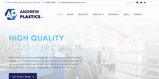
Andrew Plastics Ltd. is a renowned Plastic Injection Moulding company. It boasts over 70 years of experience in the manufacturing industry. The company was in requirement of a compelling website to deliver them ample exposure, communicate their vision, and improve customer satisfaction.
The website of the company now represents everything that they stand for. The company features a clean, easy to navigate, and simplistic design. The website attractively displays the services, the sectors in which the company works, and the overall company history, and much more. The website also serves to be a hub for learning with the help of effective content marketing. You will find that the blog section is filled with ample resources featuring the best SEO practices in use.
Beta Solutions
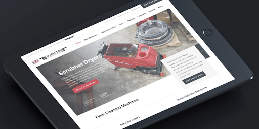
The company claims that it has been the core of the production of heavy-duty industrial cleaning machines for over 30 years. The company is based in the United Kingdom. The team here is specialized in the production of sturdy, hard-working, and durable floor cleaning machinery for fabrication, manufacturing, engineering, food & beverages, warehousing, and several other industries.
Beta Solutions was in need of a website for communicating its incredible range of products & services while positioning itself as the expert brand. Website designers made use of content marketing in the best possible manner. A multi-channel approach is used for targeting the buyer personas while answering questions and educating readers.
The website currently showcases the Beta brand, its impressive range of products & services, and the industries they work with with great detail. The website puts forth all important information that is relevant to the end-users.
On the Level
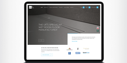
The company is a reputed trade wet room manufacturer and supplier. The company has its renowned name in the construction industry for its high-end project work along with ample modular expertise for high-end projects. The overall work of the company is quite impressive.
On The Level had been keen on developing a website solution to serve as a long-term digital strategy for the period of 5 years. The final outcome of its website design revealed a current and simplistic website feature with strategic customer journeys and guaranteed customer satisfaction.
The website designers of the company made use of ample immersive videos along with SEO-centric content for engaging the users.
Lockheed Martin
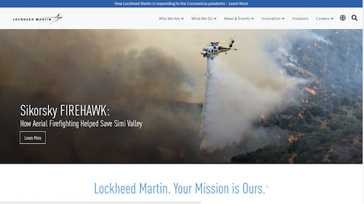
Lockheed Martin is a renowned name in the field of aerospace brands out there. Therefore, there is no denying the fact that the website design of Lockheed Martin is just as airy and free as it can get.
The design of the website differentiates itself with the smart use of imagery. There is also the presence of a dropdown menu for allowing potential customers to find the respective area of interest quite instantly. Even with the bold design options, the website features a highly responsive design. Therefore, it is capable of working effectively on a wide range of mobile devices as well.
NTS Unitek
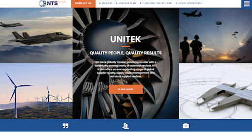
The website of NTS Unitek excels in its use of high-quality imagery along with intuitive content to draw the attention of the visitors. The site features striking images of high-end technology in action. The written copy of the website is concise and well-defined. Therefore, the website allows its visitors to know what they are doing in the right manner.
The website also features a separate “Learn More” Call-to-Action (CTA) icon for inviting website visitors to explore the website more. The icon allows them to garner in-depth knowledge about the organization and the industry as a whole.
Right below the main images, the website presents a detailed menu of the respective services that can be tabbed. Therefore, there is the presentation of a single service at a particular moment unless the visitors would click on additional services. The website designers have been quite flawless in the overall presentation and self-promotion of the brand itself. There is a dedicated testimonial section for offering access to two testimonials at a time.
PR Hoffman
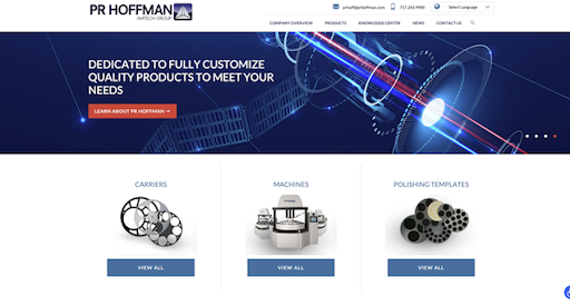
The company features an attractive website featuring a main hero image appearing as a slideshow moving about every 30 seconds. Every hero image present in the slideshow feature has a unique copy for explaining what the manufacturing company is capable of doing for its customers. It offers its visitors the feeling that the company is advanced technologically while being quite futuristic at the same time.
The website also features detailed contact information at a visible space of the page. There are three distinct categories of products that are placed under the main hero image of the website. These categories invite prospective customers to go on exploring while learning more about the products and services that are offered.
The best part is that the website also features a short video at the homepage’s bottom for allowing the visitors to know about the working of different machines.
John Deere
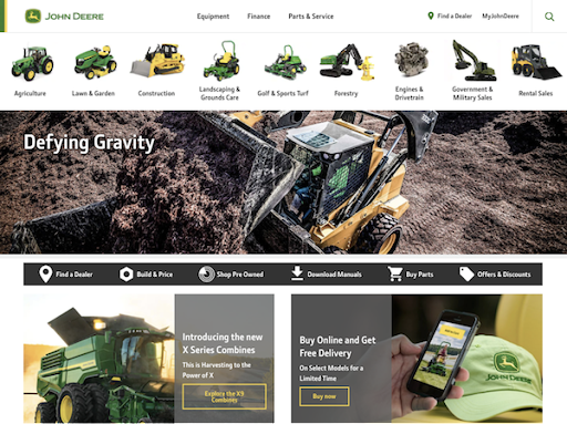
John Deere is undeniably one of the leading manufacturing brands in the entire world. As such, it is no surprise that the leading manufacturing brand also excels its website. The brand is responsible for delivering amazing user experiences while providing ample menu options on the homepage with the help of engaging images.
The website is capable of appealing to all its visitors. It makes use of impressive content marketing strategies for adding more value for the visitors. The publication by the company “The John Deere Journal” is situated at the website’s footer section. The brand’s website also showcases real stories to include a human element for resonating well with the customers.
Marlin Steel
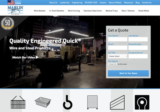
The official website of the manufacturing company performs exceedingly when it comes to using video for the homepage. This helps in effectively drawing the active attention of the site visitors. The site also features specialized conversion elements throughout the design. Moreover, the brand also boasts an extensive product offering.
The site serves to be simple and easy-to-navigate for first-time users. It delivers accurate specifications and a proper quote with the help of just a few clicks on the homepage.
FireRock
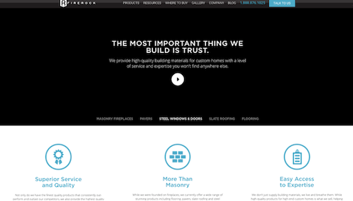
The website is about a leading building solution brand. FireRock provides building solutions for both end users as well as contractors that are planning their customized home projects. Therefore, it is no surprise that the website design of the brand incorporates some of the most intriguing ideas in its B2C designs.
Along with the easy-to-navigate features and accurate subsections, the slogan remains at the front & center of the website.
Conclusion
Our shortlist of manufacturing website examples is a great starting point for those who wish to create an impactful, professional, and informative site. From the navigation layout to colour palette options, you will come across ample inspiration from these websites that are designed by leading designers. If you need help with your existing or new manufacturing website, please reach out to the team here at Curve Communications.
